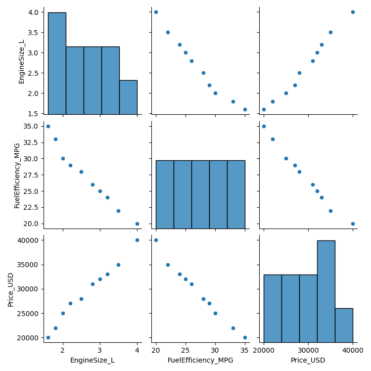
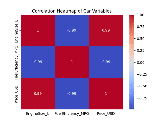
3. A dataset contains information about car models, including the engine size (in Liters), fuel efficiency (miles per gallon), and car price. Use a pair plot or correlation matrix to explore the relationships between these variables. Which variables seem to have the strongest relationships, and what might be the practical significance of these findings?
PROGRAM:
import pandas as pd
import seaborn as sns
import matplotlib.pyplot as plt

# dataset
data = {
    'EngineSize_L': [1.6, 2.0, 2.5, 3.0, 3.5, 4.0, 2.2, 1.8, 3.2, 2.8],
    'FuelEfficiency_MPG': [35, 30, 28, 25, 22, 20, 29, 33, 24, 26],
    'Price_USD': [20000, 25000, 28000, 32000, 35000, 40000, 27000, 22000, 33000, 31000]
}

# Create DataFrame
df = pd.DataFrame(data)

# --- Pair Plot ---
sns.pairplot(df)
plt.suptitle("Pair Plot of Car Variables", y=1.02)
plt.show()

# --- Correlation Matrix ---
corr_matrix = df.corr()
print("Correlation Matrix:\n", corr_matrix)

# --- Heatmap for better visualization ---
sns.heatmap(corr_matrix, annot=True, cmap='coolwarm')
plt.title("Correlation Heatmap of Car Variables")
plt.show()OUTPUT:
Correlation Matrix:
                     EngineSize_L  FuelEfficiency_MPG  Price_USD
EngineSize_L            1.000000           -0.985854   0.992210
FuelEfficiency_MPG     -0.985854            1.000000  -0.993457
Price_USD               0.992210           -0.993457   1.000000